SaaS B2B start-up. Bridging the gap between product and revenue motion. Focusing sales teams on the best prospects and converting free users faster.
Introduction
As the first, and only designer at this start-up, I wore all the design hats at the same time.
Core UX, direction & strategy, UI systems, marketing, video, motion, animation.
Build an identity
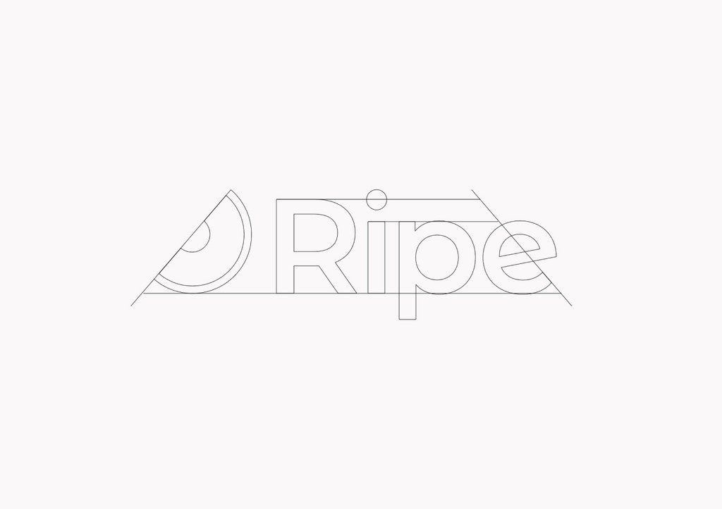
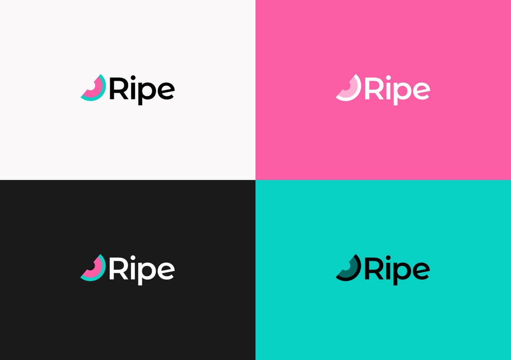
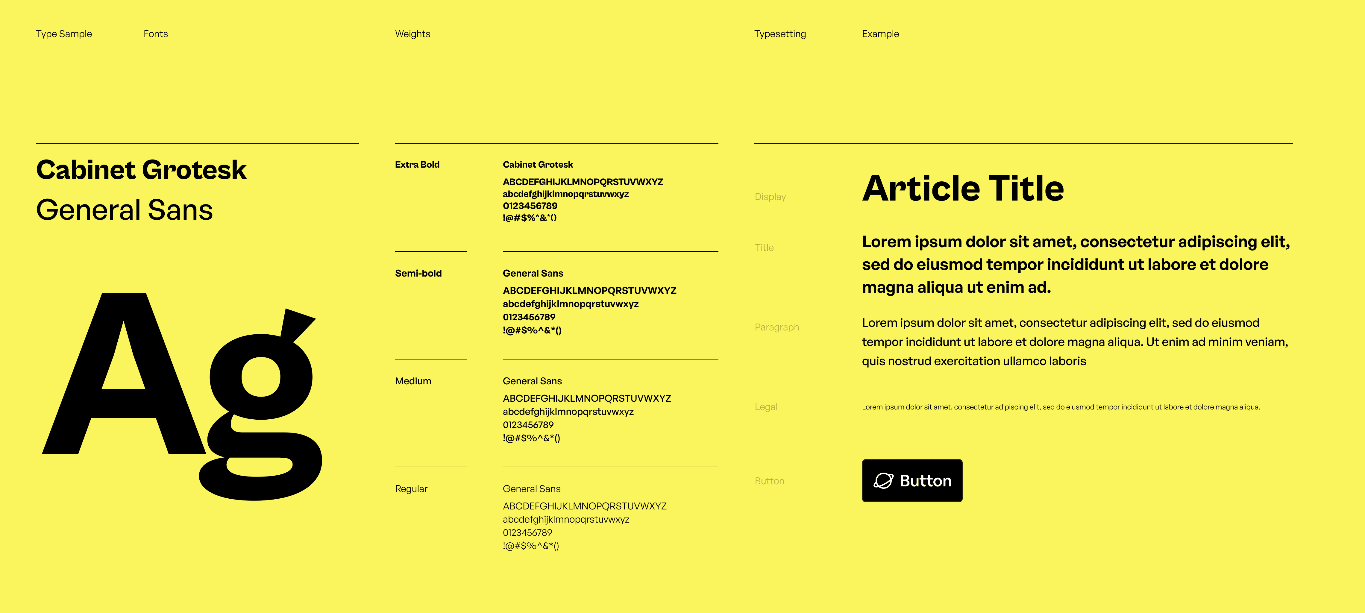
All we had was a name and a problem to solve. When someone starts using your product, there is an optimal time to approach them for a successful sales pitch. This person could therefore be compared to a fruit on a tree. Not too early, not too late. Perfectly ripe. This fruit theme influenced the logo and the colour palette.
Build a system
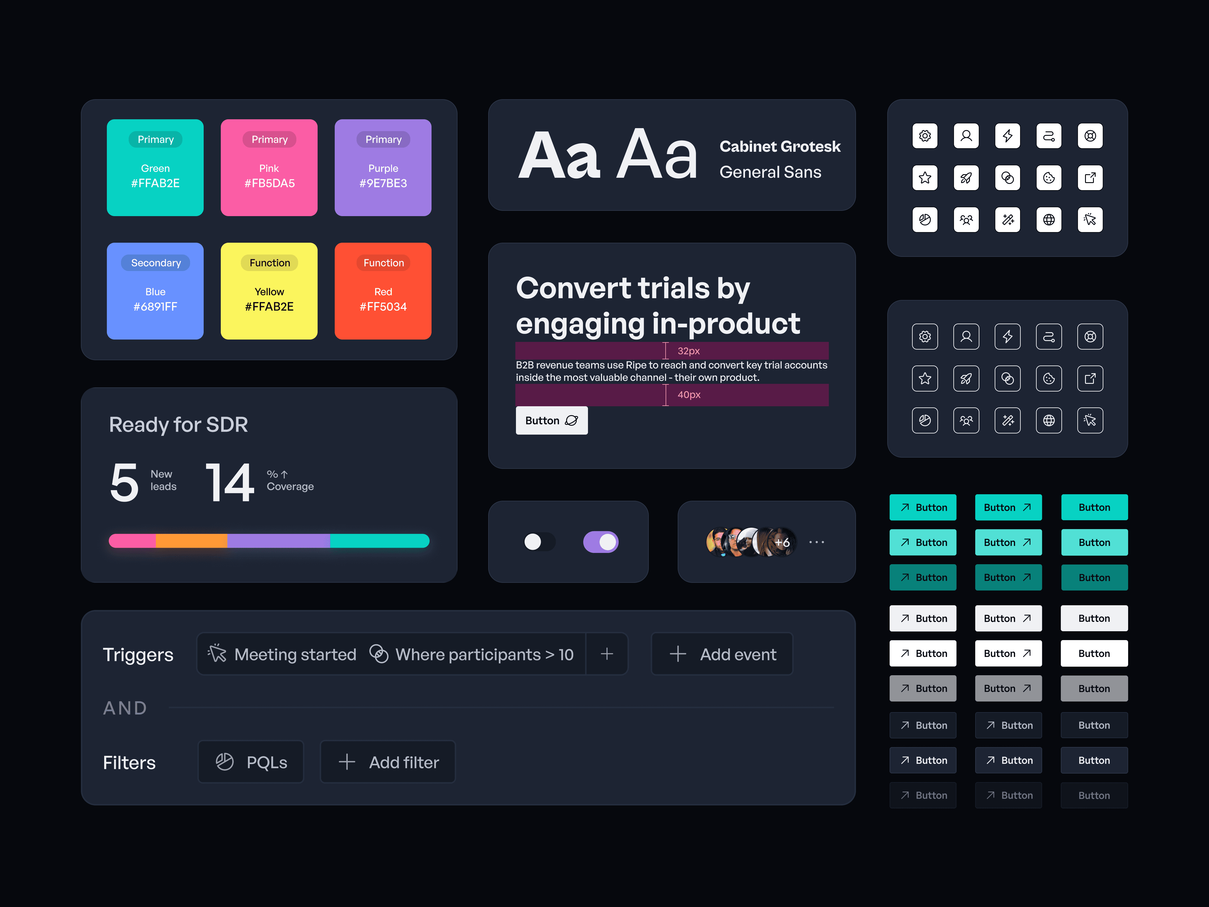
Starting from scratch, I workshopped withe the engineers. Together we selected Chakra as the best foundational css library to build on. Ripe's UI theme was inspired by Linear with the addition of bright, neon highlights to be sparingly used.
Data visualisation & animation
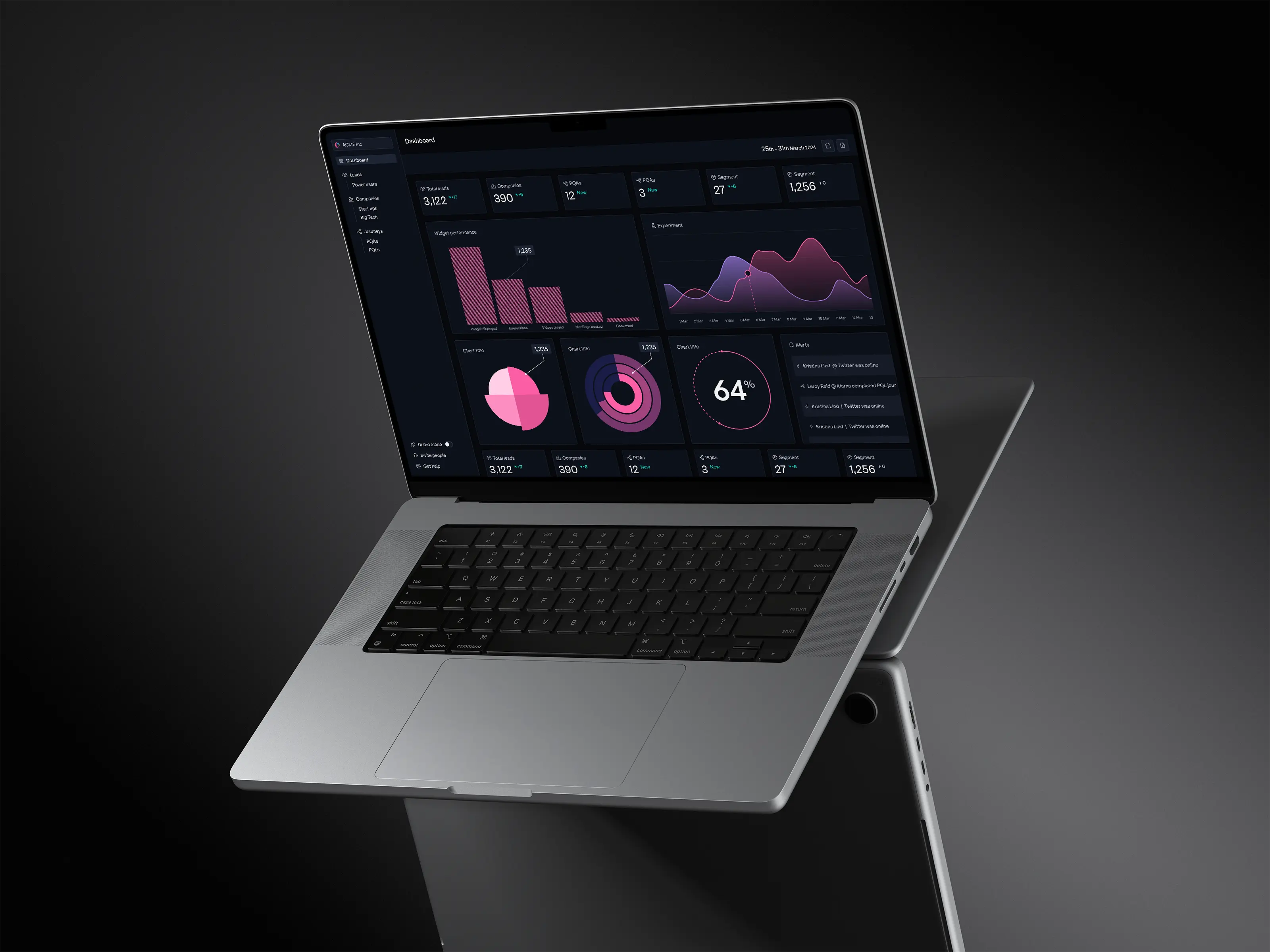
Data feedback is pivotal in Ripe. I set motion guidelines and created a suite of graphics.
More to come
This case study is in it's early stages. More contents is available for presentation
